
-1.png)

Table of Contents
Like this article?
Subscribe to our Linkedin Newsletter to receive more educational content
Subscribe nowCustomer-Facing Reliability Powered by Service-Level Objectives
Service Availability Powered by Service-Level Objectives
Learn More
Integrate with your existing monitoring tools to create simple and composite SLOs

Rely on patented algorithms to calculate accurate and trustworthy SLOs

Fast forward historical data to define accurate SLOs and SLIs in minutes
Customer-Facing Reliability Powered by Service-Level Objectives
Service Availability Powered by Service-Level Objectives
Learn More
SLI degradation and user impact
SLI degradation refers to a measurable decline in a service's ability to meet its defined success criteria, based on a Service Level Indicator (SLI). It is calculated as a reduction in the ratio of "good" events to "total" events, where a good event might be defined as a request completed within 300ms or a successful response code. This leads directly into how we measure it.
Calculation for this incident response metric
SLI Success Rate = (Good Events / Total Events) × 100
Example: An API handles 12,000 sign-up requests in 10 minutes. If 11,640 of those succeed under the 300ms latency threshold, then:
SLI Success Rate = (11,640 / 12,000) × 100 = 97%.
Compared against an SLO target of 99.5%, this drop to 97% signals significant user impact. From here, it’s essential to examine how these numbers translate into actions during incidents.
Practical application of this incident response metric
SLI degradation enables early detection of issues, often before a traditional alert is triggered. Beyond detection, it should drive concrete actions. For example, suppose login success rates dip below target. In that case, the team might immediately roll back a deployment, reroute traffic to a healthy region, or spin up additional capacity to absorb the load.
If degradation is tied to a dependency, the incident commander can escalate to the owning team or trigger predefined failover runbooks. In cases of rising latency, throttling non-critical requests can preserve core user journeys. This real-time signal also connects to other reliability measures, showing how short-term failures accumulate into broader patterns.
Connection to other incident response metrics
SLI degradation is the real-time indicator of trouble. Error budget burn then quantifies the accumulated impact of such degradations over the SLO window. Together, they offer both immediate and long-term perspectives, providing a more comprehensive view of reliability.
Visualization and validation for this incident response metric
Observability platforms ingest structured metrics and visualize success rates over time. These tools allow teams to pinpoint when and where user experience dropped. It is critical to validate SLIs continuously to ensure they match real expectations as systems and user needs evolve.
Time to budget recovery
Time to budget recovery (TTBR) measures the duration of a service's non-compliance with its service level objective (SLO) following the onset of a degradation or outage. It starts when the system first breaches the SLO threshold and ends once it returns to a state where the reliability metrics are back within the acceptable range. TTBR captures the full duration during which users experience degraded performance, providing a more accurate reflection of reliability from the user’s perspective.
For example, if an API breaches its latency SLO at 2:00 AM and recovers at 3:45 AM, then the TTBR is 1 hour and 45 minutes, even if technical mitigations began earlier. While the team acted quickly, users still experienced degraded performance for nearly two hours. This context is critical for understanding service resilience, not just responsiveness. This naturally raises the question of how TTBR is measured in practice.
How this incident response metric is measured
TTBR is typically derived by tracking time-series compliance data for a given SLI. Once the SLI drops below the SLO threshold (e.g., success rate falls below 99.9%), the clock starts. The timer stops only when the success rate rises above the threshold and remains consistently above it over a defined smoothing window.
Some platforms allow teams to annotate SLO breaches on dashboards, visually showing TTBR and correlating recovery times with remediation efforts. Measurement reveals the mechanics, but understanding the value of TTBR requires examining why it matters.
Why this incident response metric matters
What makes TTBR distinct is its temporal focus. While SLI degradation detects a real-time drop in performance, and error budget burn measures how much of the buffer was consumed, TTBR reveals how long the service remained outside acceptable bounds.
This incident response metric emphasizes the duration of user impact rather than just the depth or speed of failure. From here, the focus shifts from concept to action, how teams actually use TTBR in practice.
Practical application of this incident response metric
Understanding TTBR is essential in retrospectives. If a service repeatedly takes too long to recover, even from minor degradations, this signals fragility in either architecture or workflows. Over time, this could erode customer trust even if uptime metrics look healthy.
For example, one team found their TTBR for database-related incidents averaged 2 hours, far higher than other services. The investigation revealed that recovery relied on manual failover steps. Automating this process reduced TTBR to 15 minutes, directly improving customer experience and confidence. Along with practical applications, TTBR can also serve as a basis for comparisons.
Comparisons and trends for this incident response metric
Comparing TTBR across services highlights bottlenecks in incident management. If one team consistently restores compliance faster, it may reflect stronger tooling, runbooks, or redundancy. Tracking TTBR over time also exposes systemic challenges that may not be visible from error budget or burn rate metrics alone. These comparisons naturally lead to planning, showing how organizations can utilize TTBR insights to enhance reliability in the long term.
Operational planning for this incident response metric
In mature SLO practices, TTBR informs architectural planning and capacity management. Services with long TTBRs may need redundancy or autoscaling improvements, while those with short but frequent TTBRs might benefit from better alert tuning or escalation policies. Breaking TTBR into patterns, such as long recovery versus frequent small outages, helps organizations prioritize the right reliability investments.
Error budget burn rate
Error budget burn rate measures how quickly a service consumes its allowable error margin over a defined time window. It emphasizes velocity and the pace of consumption By highlighting the speed of consumption, error budget burn rate becomes highly actionable during incidents and central to shaping alerting and escalation strategies.
To illustrate, consider a 30‑day SLO with 99.9% availability, allowing for 43.2 minutes of downtime. If the system is experiencing issues at a pace that would consume the entire error budget in 15 days, it is burning at a 2x error budget burn rate. The “2x” indicates twice the expected rate of consumption, signaling urgent degradation even if the budget has not yet been fully utilized. This example illustrates why error budget burn rate adds urgency that raw budget numbers may overlook.
Multi-window monitoring
Building on this, the error budget burn rate is most effective when monitored across multiple time windows. A short window, like 5 minutes, detects acute reliability regressions and catches sudden drops in user experience. A high error budget burn rate over a short window (e.g., >2x) indicates accelerated failures and may justify immediate paging. In contrast, a longer window, such as 1 hour, highlights sustained degradations that are often missed by short-term alerts. A persistent 1x or higher error budget burn rate over a long window may not trigger an immediate incident, but it signals the need for mitigation to avoid budget exhaustion.
The strength of this multi-window approach lies in its ability to strike a balance between responsiveness and stability. It avoids triggering alerts for brief blips that self‑resolve while still surfacing systemic failures that unfold over time. This dynamic alerting strategy reduces noise and fatigue compared to static threshold monitoring, resulting in smoother operational decision making.
Post-incident and diagnostic use of this incident response metric
Beyond real-time monitoring, the error budget burn rate is a valuable post-incident diagnostic tool. Teams can review how quickly the error budget was consumed during an event, assess whether alerting thresholds were met at the right time, and evaluate if the incident response pace matched the urgency indicated by the error budget burn rate. This reflective use connects immediate response with longer‑term reliability learning.
A dashboard visualizing multiple incident response metrics, including an SLI indicator, error budget burn rate, reliability burn down, and error budget remaining. (Source)
Advanced use cases for this incident response metric
In complex systems, tracking error budget burn rates per SLI, service, or environment can isolate noisy workloads, identify problematic release pipelines, or compare reliability across regions. For example, suppose a new feature deployment causes a 3.5x burn rate in just one availability zone. In that case, that signal can drive a targeted rollback or failover without disrupting users elsewhere who are unaffected.
Unlike SLI degradation and error budget burn, error budget burn rate offers a forward‑looking view: At this pace, how long until reliability margin runs out? This predictive quality bridges operational awareness and strategic planning, making it an ideal metric for prioritizing incidents, escalating them appropriately, and driving service-level ownership across distributed teams.
Burn rate trends
Burn rate trends represent the long-term behavior of how quickly a service consumes its error budget over time. Unlike real-time metrics that focus on the immediate impact of incidents, burn rate trends enable engineering teams to understand and respond to systemic patterns of reliability risk. They allow organizations to identify when services are approaching instability, even if no single event exceeds the SLO.
Identifying patterns vs anomalies in incident response metrics
A one-time burn spike might not warrant a structural change, but a recurring pattern, such as an elevated burn every Friday night, suggests deeper problems, like batch job contention, traffic surges, or infrastructure saturation. Recognizing these rhythms helps align operational controls and scaling strategies more effectively. Transitioning from spotting anomalies, the next step is to use these insights for longer-term planning.
Strategic planning and forecasting
During quarterly reviews and roadmap planning, burn rate trends highlight systemic risks. For example, if a service consistently consumes 80% of its budget month-over-month, it is operating without a margin of safety. This insight informs architectural adjustments or changes to reliability targets. Similarly, observing steadily rising burn trends can forecast when usage growth or system complexity will exceed current capacity. Let’s consider the following example to illustrate how teams respond in practice.
Imagine a graph of a checkout API’s burn rate trend steadily climbing after three product releases. Each release stays technically within the SLO, but the upward slope shows instability building over time. This signal might lead teams to shard databases or add caching layers before outages occur. To make this insight more tangible, it helps to describe how such a pattern might look in a visualization. Here’s the line chart representation of the burn rate trend:
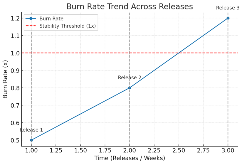
Example: burn rate vs. releases over time. Each release is marked with a vertical line. The red dashed line at 1x indicates the stability threshold.
Building from visualization, teams can then focus on implementing monitoring practices to act on these signals.
Actionable implementation of this incident response metric
Teams use monitoring and observability tools, such as Datadog and Prometheus, alongside reliability management platforms like Nobl9, to plot rolling averages of burn rate over time. Common windows include one week, one month, and one quarter.
Thresholds such as “consistent >1x burn rate for 4 weeks” are often flagged for proactive action. This transforms trend data into actionable guidance for capacity planning, feature rollout monitoring, and technical debt reduction. These actions then naturally connect to the broader strategy of making SLO metrics drivers of long-term reliability.
Incident recurrence impact
Incident recurrence impact quantifies not just how often an incident happens (frequency), but also how significantly it affects users each time (impact). These two dimensions, recurrence frequency and impact, together provide a more complete picture of unresolved reliability risks.
Measuring frequency and impact
To measure recurrence frequency, teams can track the number of SLO violations tied to the same SLI or failure pattern within a fixed time frame (e.g., 3 violations of checkout latency SLO in one quarter). This is not simply counting incidents by name, but associating them through shared telemetry patterns, root cause tags, or failed SLO conditions. Impact, on the other hand, is quantified through the amount of error budget burned per recurrence, or the number of users affected (if user sessions or transactions are available as a denominator). A single high-impact recurrence that burns 40% of a monthly error budget, for example, may warrant more urgent architectural remediation than three low-impact recurrences that together consume 10%.
Calculation approach for this incident response metric
The combined metric is often expressed as recurrence × impact, but in practice, this does not require a literal multiplication. Many teams normalize recurrence and impact on a common scale (e.g., 1–5) and then multiply or weight them to produce a composite score. For example, if frequency = 3 (moderate) and impact = 4 (high), the recurrence impact score would be 12, flagging this service as a hotspot compared to another with a score of 4 (frequency = 2, impact = 2). This makes the calculation concrete and actionable. Moving from calculation to action is where this metric gains its real value.
From score to action
With this score in hand, the next question is: so what? Teams should act by prioritizing permanent fixes, redesigning workflows, or investing in architectural changes when recurrence impact scores exceed agreed thresholds. For instance, repeated latency violations in a checkout service may trigger investment in database replication or queue-based processing to eliminate systemic weaknesses.
The metric directly informs decision making, rather than remaining abstract. Having identified where recurrence is most harmful, the focus shifts naturally to tracking and monitoring.
Practical tracking of this incident response metric
To effectively track the impact of incident recurrence, teams can annotate SLO timelines to mark when an incident occurred, what was impacted, and how it was mitigated. These annotations can include identifiers such as incident ticket numbers or labels indicating the suspected root cause, effectively serving as structured metadata over time.
When visualized on dashboards, this allows for a time-based view of related incidents, making it easier to spot patterns or clusters of recurrence. The resulting analysis not only highlights where issues cluster, but also guides concrete remediation strategies tied to those hotspots. Once trends are clear, visual tools can further enhance decision making.
 An incident response dashboard with a one-month time window. (Source)
Illustrative heatmap example
Imagine a heatmap grid where rows represent services (e.g., Checkout API, Payments Service, Analytics Pipeline) and columns represent recurrence frequency levels (Low, Medium, High). The color intensity reflects the severity of the impact, ranging from light yellow (minor) to deep red (severe).
For example, the Payments Service might appear in a deep red cell at High frequency, signaling urgent architectural remediation. This visualization allows leaders to instantly see which systems have the highest recurrence impact scores and prioritize fixes accordingly..%20Columns%20=%20recurrence%20frequency%20(Low%20%E2%86%92%20High).%20Color%20intensity%20=%20impact%20severity%20(yellow%20=%20minor%2c%20red%20=%20seve.png?width=866&height=611&name=Example%20incident%20recurrence%20heatmap%20for%20multiple%20services.%20Rows%20=%20services%20(e.g.%2c%20Checkout%20API%2c%20Payments%20Service).%20Columns%20=%20recurrence%20frequency%20(Low%20%E2%86%92%20High).%20Color%20intensity%20=%20impact%20severity%20(yellow%20=%20minor%2c%20red%20=%20seve.png)
Navigate Chapters: