
-1.png)


Have you ever wondered how you could get a real-time snapshot of your services’ status? Or wished you could instantly gauge the impact of an incident?
We’re thrilled to introduce a new functionality in the Nobl9 platform that does just that - the Service Health Dashboard by Burn Rate.
Previously, we introduced the Service Health Dashboard (SHD). This feature visualizes service health based on the remaining budget of underlying Service Level Objectives (SLOs). It was a game-changer, enabling customers to pinpoint services with reliability issues approaching or exceeding their error budget. It gave customers a bird' s-eye view of their services' reliability status.
But we didn’t stop there. We recognized the need for a feature to provide a real-time snapshot of service states, enabling customers to act before the error budget reached critical levels. And so, the Service Health Dashboard by Burn Rate was born.
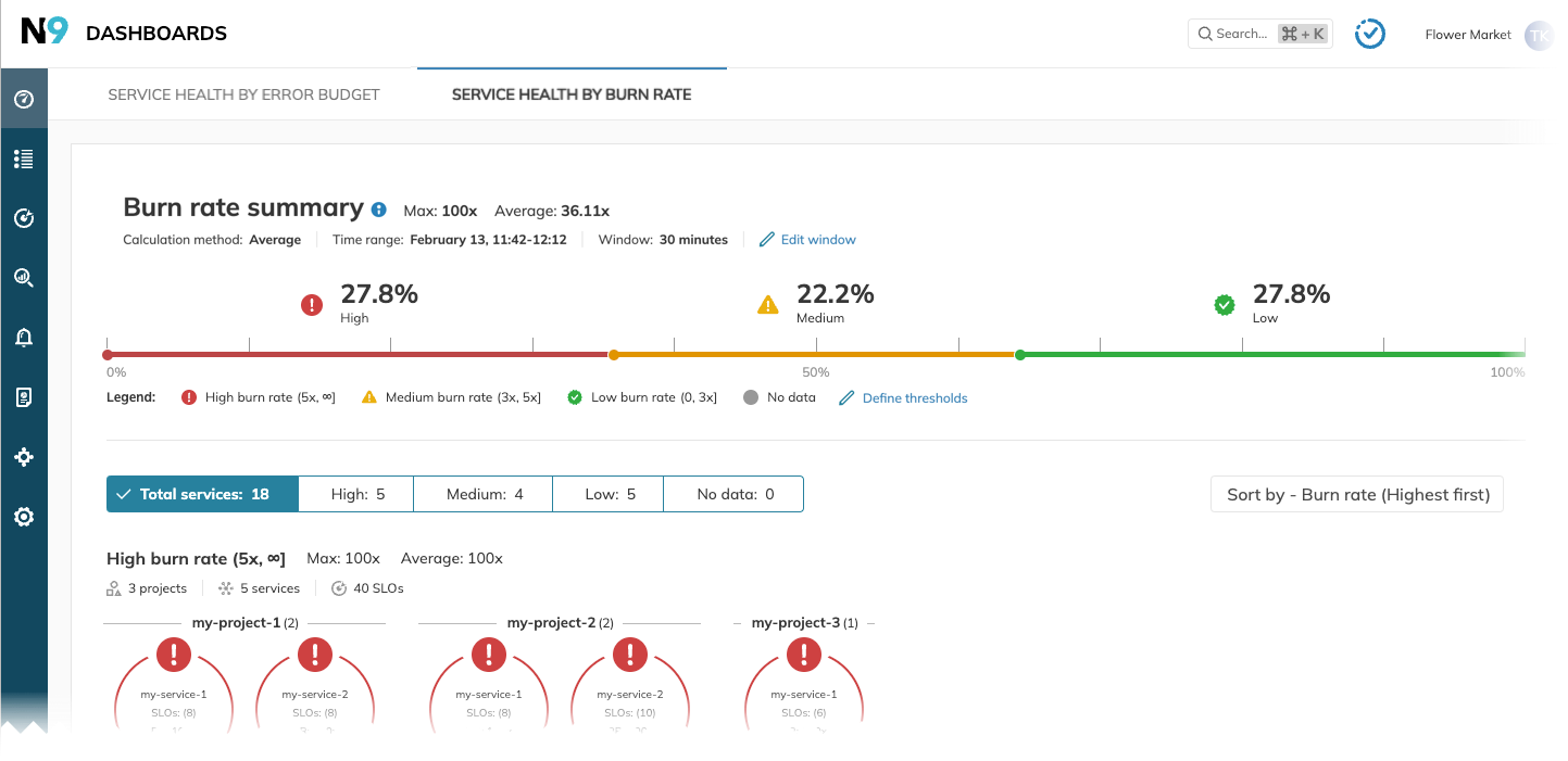
This new dashboard is a powerful tool that presents the health of services based on the current burn rate values of their SLOs. It provides an operational perspective of service health, highlighting services currently facing issues.
The new SHD by Burn Rate enhances Nobl9’s role as a reliability hub, promoting its usage within organizations that have distributed monitoring solutions and lack a single health status overview.
The new dashboard is a treasure trove of features. It’s a valuable resource for the granularities of an engineer’s day-to-day operations, offering troubleshooting and support communication benefits while providing an executive summary of the impact of an ongoing incident. In addition, it’s user-friendly, requiring no prior knowledge of SLO methodology to observe service health and identify areas that need attention.
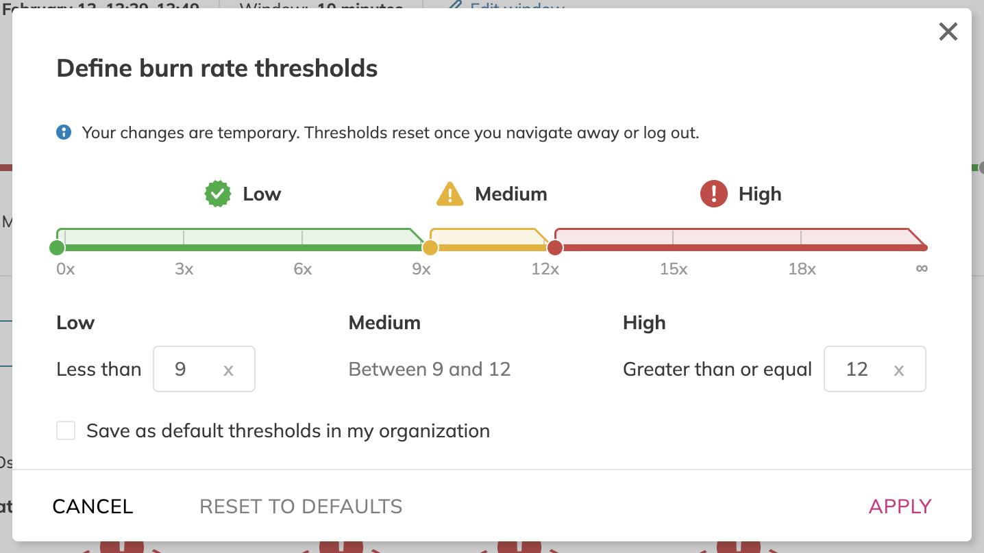
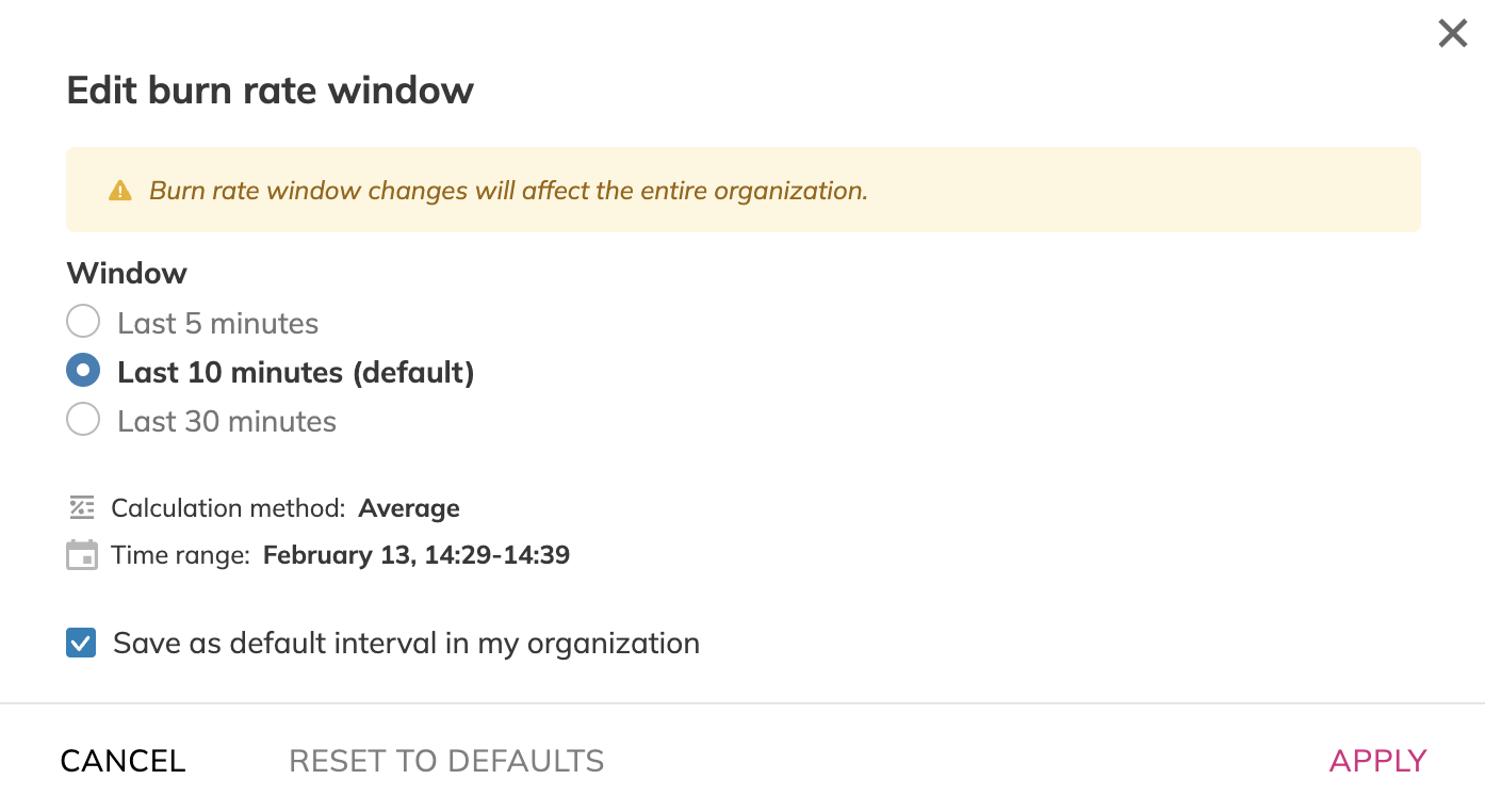
Services are categorized based on the severity of the burn rate. You can tune the severity of burn rates by defining burn rate thresholds, offering a custom view of what is performing below your expectations. Each section provides statistics on the number of projects, services, and SLOs, all based on your defined burn rate thresholds. You can also set default thresholds so those unfamiliar with SLO or reliability methodologies can see an accurate representation of how services are performing. Setting time windows of service burn rate also allows further customization throughout the new feature.
Meanwhile, the existing Service Health Dashboard has been renamed the Service Health Dashboard by Error Budget. Both dashboards complement each other. One gives you an overview of what’s happening now, and the other shows you which services were in a bad state long enough for the error budget to run out.
We believe that the new Service Health Dashboard by Burn Rate will significantly enhance the Nobl9 platform's value and usability. We look forward to your feedback and can’t wait to see how you leverage this new feature in your operations.
Interested in the SHD by Burn Rate or want to see our other feature offerings? Request a demo here. We also offer a free edition of our platform so that you can try out the SHD by Burn Rate yourself.
Share:


Do you want to add something? Leave a comment